


Novel Covers For the Britpop series
Elise Boissonneau • Novel Notes 1

When I wrote the first Britpop novel, I had a hard time finding an image for the cover. I didn’t want Britpop's face on the cover. I wanted the reader to use their imagination. That is also why I write limited physical descriptions of the characters.
I settled on a nautical stock image. I wasn’t totally in love with it. It was too busy to be a great cover. But it did represent the era of the book and was nautical. So I went with it.

Now that I have decided to make Britpop into a series, I thought it would be a good time to do some matching, similar covers. Sure, I would love to have custom book covers made for the series, but the cost is too high. The first novel has only sold 37 copies (26 free copies were also downloaded during a promotion), so there is no reason to think I would recoup hundred of dollars for covers.
If by some miracle, the books take off, I might consider custom covers. Barring that, I will stick with making my own covers.
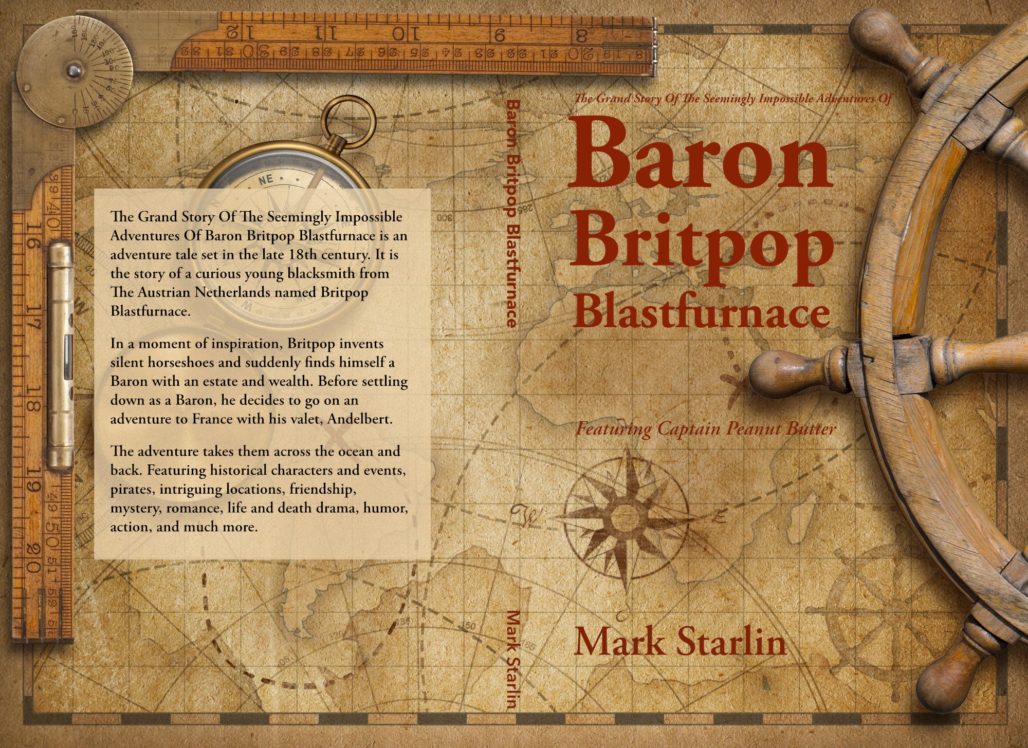
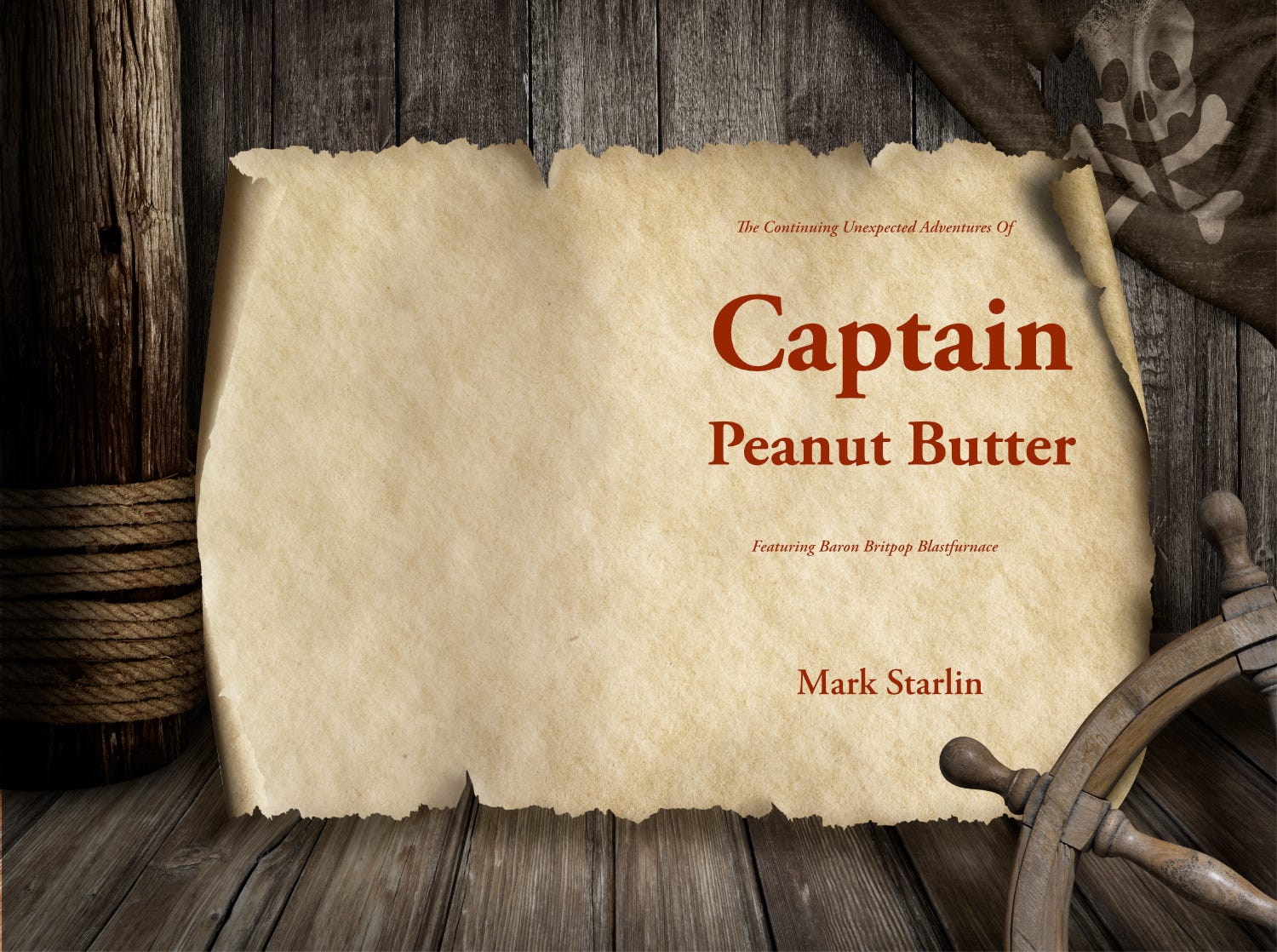
I went on Shutterstock (with a 25% off coupon) and found three similar images by the same photographer. They all had similar “nautical” themes. One even had a pirate flag! Perfect for the Captain Peanut Butter novel. For $35, I was allowed to download five images. I downloaded four (I am hoping he will make one more similar.) I will save the fourth one in case I decide to write a fourth novel in the series.
I already switched the first novel to the new cover:
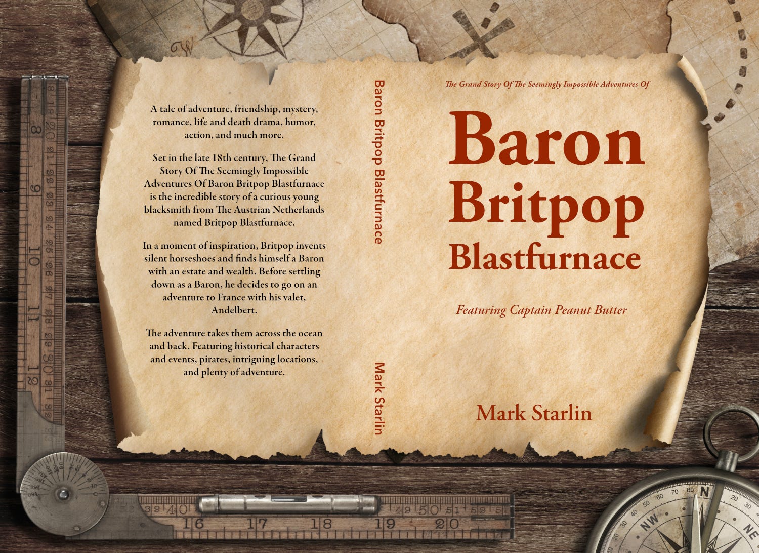
The second novel will use the following cover (still in progress.) I slanted the text to fit the map. It looked odd to me (and didn’t fit well) when it was straight. I imagine slanting cover text is a professional publishing no-no, but I plan on doing it anyway. LOL! I also deleted some mountains on the map, where Elise’s name goes, to improve legibility.
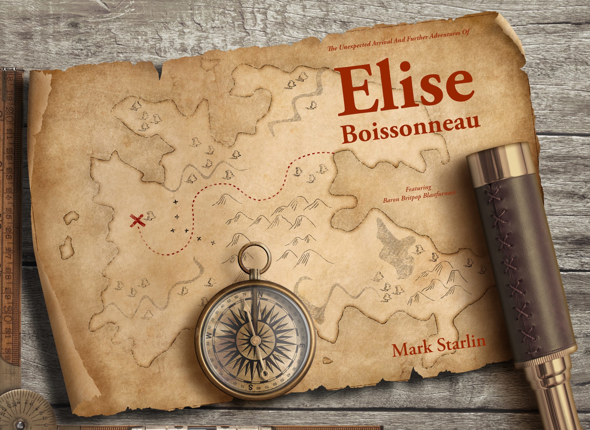
And the third book will use this image (in progress.)
I am very happy with them. I think they all go together well and each one fits the “feel” of the novel. Plus I think they seem reasonably era-appropriate.
What do you think?
Mark
I actually love all the covers. Nautical themes are the best to capture attention. Especially with younger readers. It usually means an adventure awaits! The only critique I would have is that your original novel is about the Baron, and I would assume he will play an integral part in the upcoming novels. If that is the case, I would make his name larger, call it book 2, 3, 4, etc., in the series, and place the main character's name for each consecutive book a bit smaller below the Baron's. But, that's just me.
I *love* the antique nautical theme, Mark! If you had told me that you had commissioned an artist to do them, I would have believed you — they fit your book series that well. The slanted text is spot-on, IMHO; fits better, totally legible.
I trust you’ll give credit to the artist inside the book? And maybe drop them a “Hey, I used your stuff, and it looks awesome!” note after you publish? Artists usually enjoy that kind of thing. 😊